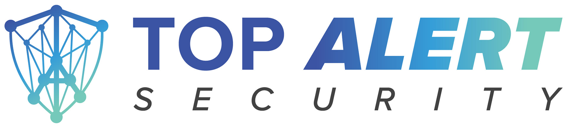

A client needed a logo for his new business. He explained how important having a shield icon was and liked the idea of the cyber data design included. I was able to incorporate a "T" and an "A" for "Top Alert" into the shield, making it stand out more with the thicker lines and bigger circles. The client wanted to use a sky blue and teal color palette, loving the gradient. I added the dark blue at the beginning of the gradient, which allows the logo to stand out more on a white background.