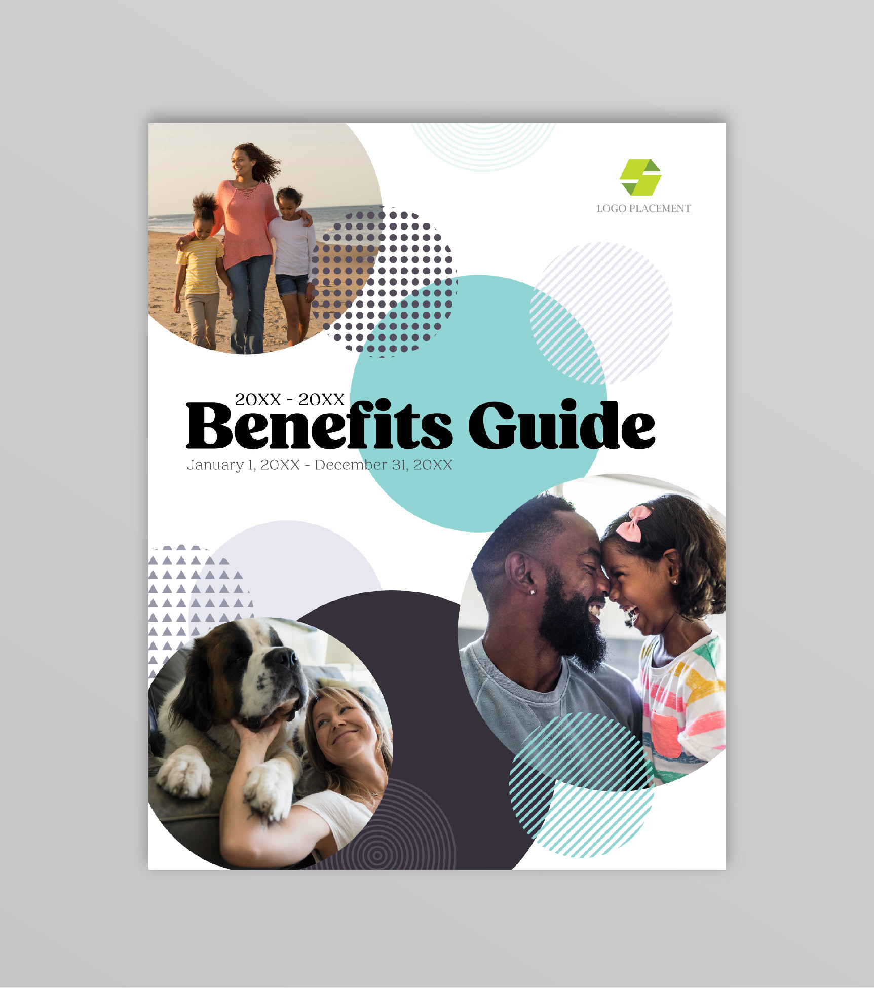
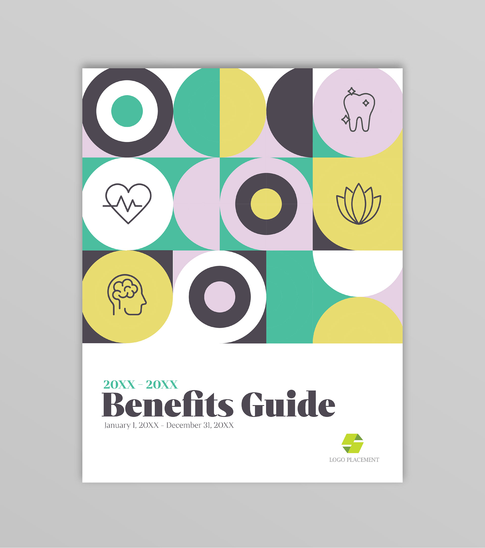

This was a fun side project I did while I was contracting with a large Insurance Brokerage company. I really enjoyed my time working there and the Creative team had a contest to design covers for the upcoming year's Benefit Guide for clients to chose from. I chose to participate and these were my 2 favorite cover options I submitted. The one on the left is clean, artistic, and gives a warm, loving emotion with the family images. The 2nd cover option (on the right), I used a fun geometric design, while incorporating icons, playing with the shapes and overlap. I liked the font I found for the text, as it has retro feel I felt went well with the design. Option 2 was a winner for the contest and I couldn't be more excited and honored to be a contributor!